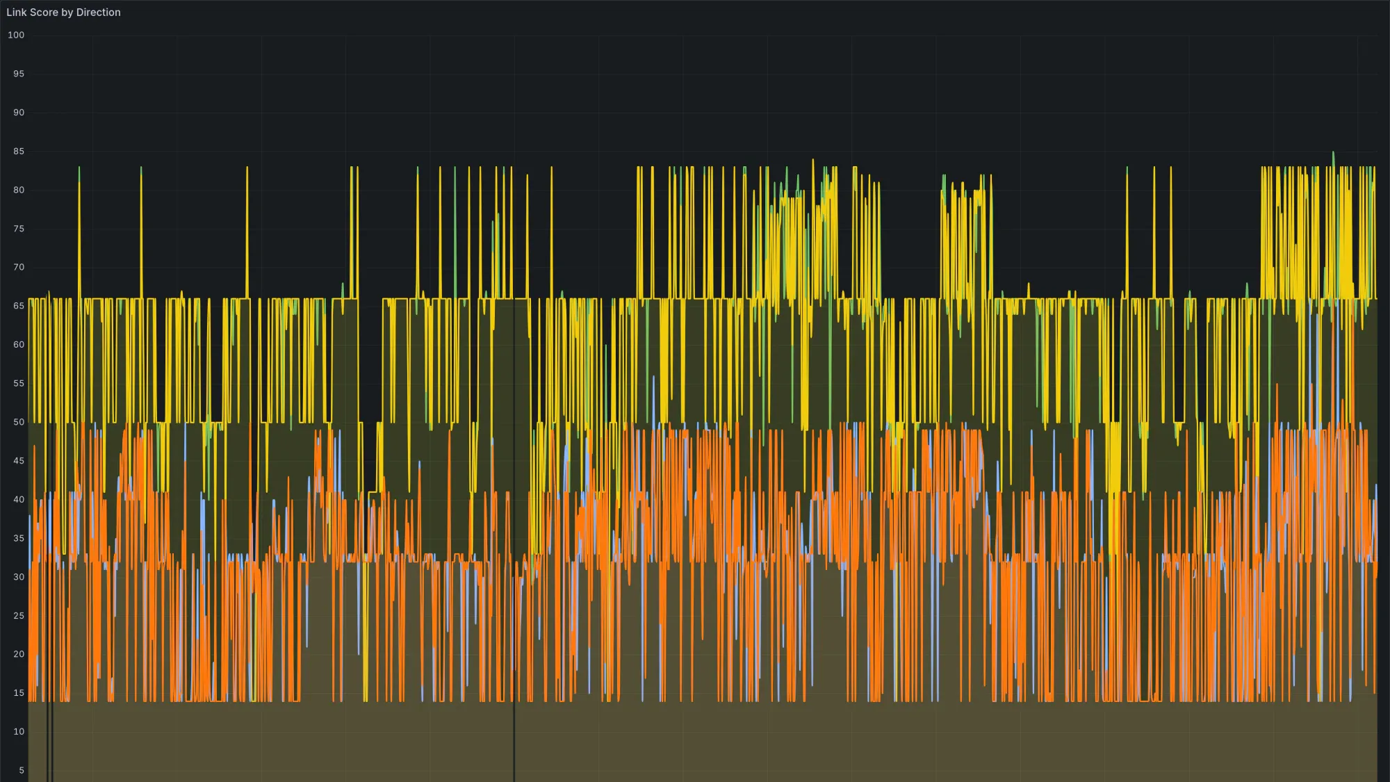
Most of the gear on my network comes with its own dashboard. The access points have one, the gateway has one, the cameras have one, and each is perfectly fine on its own. The catch is that "its own" means a different app for every box, and most of them are built to show you the current moment rather than the last month. I like seeing everything in one place, kept long enough to spot a trend, with alerts I get to write myself. So over a few evenings I wired the whole network into one monitoring stack, and the most fun part was the two radios that do not offer any tidy way to get data out at all.
The stack is the boring, dependable kind. Prometheus is a time-series database that scrapes metrics on a schedule and keeps them for as long as I have disk. Grafana draws the dashboards and fires the alerts. Both run on a small server in the rack. Once a device's numbers are in there, they stop being a live readout I have to go and look at and become history I can query, compare, and alert on. That is the whole appeal. Not that the built-in dashboards are bad, but that one place beats eleven, and a saved trend beats a needle that resets when you blink.

The easy half: the gear that already speaks the language
The UniFi side was easy, because the controller has an API and someone in the community had already written the exporter. A small collector called unifi-poller logs into the controller the way an admin would, walks every client, access point, switch, gateway, and uplink, and re-publishes all of it as Prometheus metrics. The moment those readings landed in the database I could start asking questions the stock app was not built to answer.
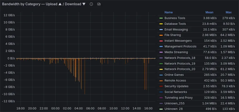
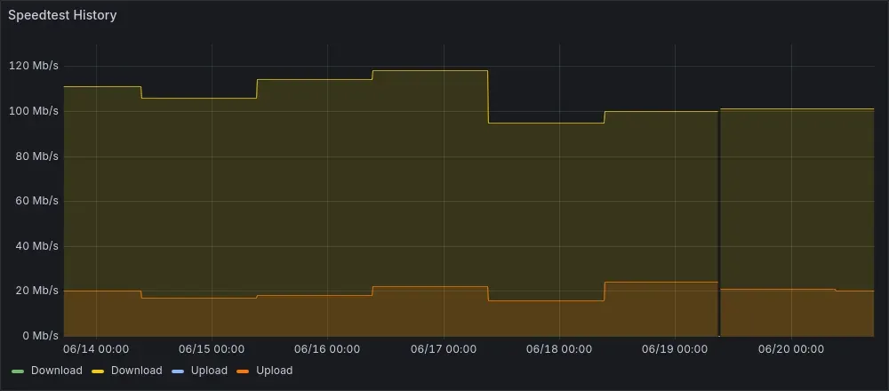
When the hardware already speaks a standard protocol and the exporter already exists, there is nothing to do but plug it in and enjoy the graphs. That covers most of a home network these days, and it is a great place to start.
The fun half: the radios with no API
The link I most wanted to watch had the least to offer. Two buildings on the property are joined by a single 60GHz point-to-point radio link, a wireless bridge that carries real traffic between them. It is fast and short and a little temperamental, because 60GHz is close to a pencil beam: it does not love rain, and it does not forgive a mount that drifts a degree. That is exactly the kind of thing I want a few days of history on, so I can see trouble building instead of just arriving.
The radios run airOS. They have a web interface and a vendor cloud, and that is the menu. No Prometheus endpoint, no clean metrics export. But the numbers I wanted, signal, link score, capacity, modulation, were all sitting right there on the radio's own status page, updating in my browser. They were never hard to reach. They just were not in a shape I could graph or alert on.
Borrowing the browser's own trick
A status page is not magic. The browser draws it by making a few requests to the radio, so I had my exporter make the same requests. It logs in the way the web interface does, fetching the login page for a session cookie and posting the same credentials the form posts, then asks for the status endpoint, which hands back the whole device state as JSON. The same JSON the page is built from. There was no protocol to reverse-engineer and nothing clever going on. It is just the conversation the browser was already having, run by a script instead of a person.
s = requests.Session()
s.verify = False                       # the radio ships a self-signed cert
s.get(f"https://{radio}/login.cgi")    # seed the session cookie
s.post(f"https://{radio}/login.cgi",   # the same POST the web UI sends
       files={"username": (None, user),
              "password": (None, pw),
              "uri":      (None, "/status.cgi")})
status = s.get(f"https://{radio}/status.cgi").json()
# every value the status page renders is now a dict I can turn into metrics
Around that core is about a hundred and seventy lines of Python, the requests library and the standard Prometheus client, set up as a collector that re-runs the scrape on every request so the numbers stay fresh. It reuses the session and logs back in if the radio drops it. It runs as a small container alongside everything else, and Prometheus scrapes it every thirty seconds like any other target.
- job_name: gigabeam
  scrape_interval: 30s
  static_configs:
    - targets: ["exporter-host:9686"]
The data was already on the screen in front of me. All I added was a script that reads it on a schedule and a place to keep it.
That is the whole of it, and it is a friendly little trick. A device that only knows how to talk to its own web page can still be talked into reporting to your database, because a web page is just an answer to a request you were always allowed to make.
What the link tells you once it is graphed
With the readings flowing in, the entire link comes down to one question, asked over and over: is the dish still aimed? Every metric is a different angle on it. Whether the link is up. Link score in each direction, kept both raw and as a thirty-minute average that smooths out the noise. Received signal against the level the radios expected at this fixed distance. Signal-to-noise. Capacity now against the capacity the link should be able to hold. The modulation index, which steps down quietly before anything actually drops. And the measured distance, which on a fixed install should never change, so when it does you know the radio has lost the plot.
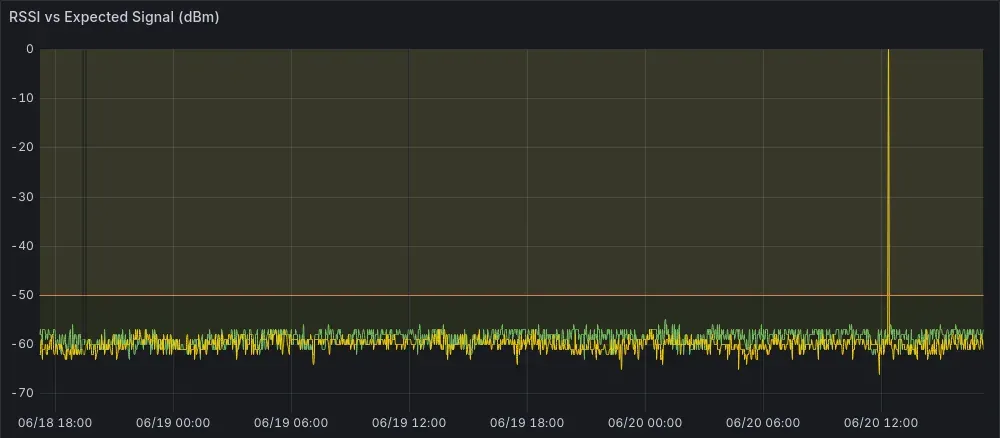
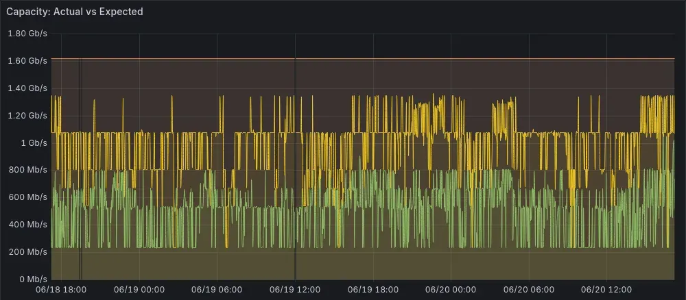
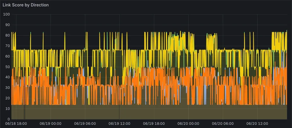
The signal trace is the one I keep coming back to. A healthy 60GHz link is boring, a flat line sitting right where it should, and boring is exactly what you want from a backhaul. The nice thing about keeping the history is that you can watch it begin to slip before it ever drops, which between two buildings is the difference between a heads-up and a surprise.
Alerts I get to write
The reason this is more than pretty graphs is that I can have it act for me. Prometheus checks a handful of rules I wrote. If the link is down for five minutes, that is critical. If the link score sits low for half an hour, that looks like real drift or a new obstruction rather than a passing gust, so it warns. If capacity collapses for a while, it warns. If the exporter or a radio goes quiet, it warns too, because a monitor that fails silently is worse than none at all.
The good part is simply that they are mine. I picked the thresholds, the timing, and where the message lands, and I can change any of them in a single line as I learn how these machines actually behave through the seasons.
The same move works on everything
None of this is special to the radios. The camera recorder came with its own app too, so another small exporter pulls its health into the same Prometheus: storage, uptime, recording state, all of it sitting right next to the radios and the switches.
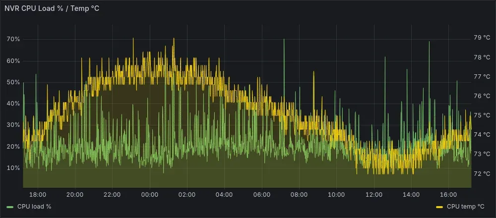
That is the pattern, and it is a cheerful one. Anything that reports a number about itself can land in the same spot. Some devices hand it over through a tidy API. A few make you script their web page. Either way it becomes one more line on one dashboard, which is all I was really after.
Why it was worth it
The hardware for the radio half came to maybe a hundred and thirty dollars of little WiFi bridges and connectors. No new sensors, because the sensors were already in the radios. No subscription, because it all runs on a box I already had. The expensive ingredient was a couple of quiet evenings and a bit of curiosity.
And the payoff is exactly what I was hoping for. The whole network, from the clients on the wifi to the 60GHz hop between the buildings to the recorder in the closet, turns up in one place, with enough history to reason about and enough alerting to give me a warning before something breaks. I did not do anything clever or sneaky. I just taught the things I already own to report to one spot, and now I can take the whole thing in at a glance. That turned out to be a genuinely satisfying way to spend a weekend.
Comments
// Comments are reviewed before appearing. No spam. No noise.